-
Originally published in April 2020 to explain the thinking behind the launch of Horne's deep-orange support and shower riser rails. Substantially revised in October 2026 to incorporate further research and design guidance.
A grab rail may be correctly positioned, but of limited use if the person who needs it cannot readily see it. The same applies to shower controls and other fittings that need to be identified and operated. In accessible showering and other sanitary facilities, visibility can affect safety, confidence and independence. Designing for visibility needs to consider more than just choosing a 'bright' colour.
How the ageing eye changes
As we age, less light reaches the retina. The pupils become smaller and the lens gradually yellows, absorbing more light towards the blue end of the visible spectrum. Changes also occur in the retina, where light-sensitive cells called cones enable colour vision. Through ageing, cone numbers remain relatively stable, but their sensitivity to shorter wavelength light diminishes, while the pathways processing their signals can also deteriorate. Together, these changes make subtle colour differences harder to distinguish, particularly along the blue–yellow discrimination axis.¹
Other light-sensitive cells, called rods, help us see in dim light, where colour sensitivity fades. Their sensitivity can also decline with age.² Alongside changes elsewhere in the visual system, this can affect contrast sensitivity — our ability to distinguish an object from its background, even when we can otherwise see reasonably clearly.
These difficulties are not confined to normal ageing; a 2024 systematic review found poorer colour vision and contrast sensitivity among people living with dementia than among comparison groups without cognitive impairment.³ Other eye and neurological conditions can introduce further difficulties, although individual experiences vary.
Why 'lasting colours' matter
As ageing affects our perception of shorter-wavelength light, colours towards the red, orange and yellow end of the visible spectrum tend to remain more readily distinguishable than blues and greens. Sometimes described as lasting colours, these hues can be particularly useful for highlighting features that people need to recognise and locate.
This is recognised in research into colour design for healthcare environments⁴ and in NHS dementia-friendly design guidance, which specifically identifies the red–yellow range as more readily recognisable than the blue–green range.⁵ A 2024 study of colour in living environments for older people also recommends red, orange and yellow for distinguishing important objects and spatial features.²
However, recognising a particular colour is not necessarily the same as distinguishing it from its background. A bright yellow rail, for example, may be readily identified as yellow yet offer insufficient tonal contrast against a pale tiled wall.
Colour and contrast: an important distinction
The expression contrasting colours can be misleading. Two surfaces may be distinctly different in hue - the colour itself, such as red, blue or green - but similar in tone, or lightness. They may therefore be surprisingly difficult to distinguish, particularly for someone with impaired vision.
For accessible fittings, tonal contrast - the difference in lightness or darkness between a fitting and its immediate background - is especially important. This can be quantified using Light Reflectance Values (LRVs), on a scale from 0 for an ideally black surface to 100 for an ideally white one.
RNIB's Building Sight guidance specifies a difference of at least 30 LRV points for features such as handrails used for orientation. Higher differences are specified for small controls, potential hazards and certain reflective surfaces.⁶
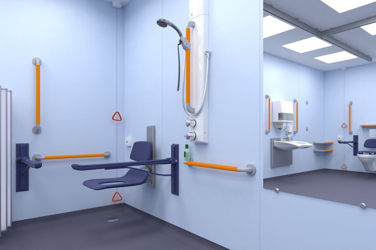
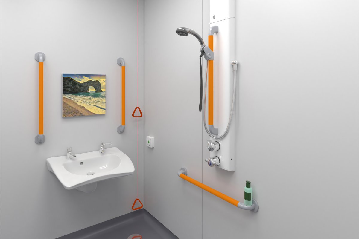
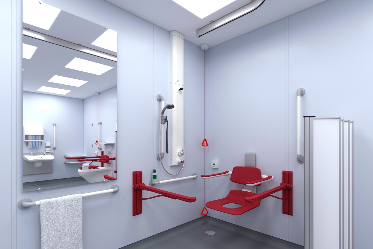
Horne's deep-orange riser and grab rails have an LRV of 27; our white equivalents have an LRV of 84.⁷ Against a pale wall with an illustrative LRV of 80, orange provides a 53-point difference, compared with just four points for white. Against a much darker wall, white may offer the stronger contrast.
Attention to visual distinction extends to other components of Horne's accessible shower panels. The riser adjustment mechanism has a grey body with a contrasting black operating lever, while the mid-grey shower hose and chromium-plated handset and lever controls are visually distinguishable against the white panel. Together, these details help make individual fittings and their operating features easier to identify.
The appropriate colour therefore depends on its background, and meaningful contrast cannot be established simply by choosing two different hues.
Why deep orange?
Bright yellow often has too high an LRV to contrast sufficiently with the pale wall finishes commonly found in bathrooms. Red may provide strong tonal contrast, but its associations with heat, warning or danger may be unhelpful where people already feel anxious or vulnerable.
Deep orange combines a warm, readily distinguishable hue with a relatively low LRV, providing useful tonal contrast against many pale backgrounds. It is a deliberate design choice, combining the advantages of colour perception with measurable visual contrast.
Visibility in everyday use
The importance of visual contrast extends beyond simply making a fitting conspicuous. Research into long-term healthcare environments highlights how contrasting surfaces and accent colours can help people recognise and navigate their surroundings.⁴ A 2024 systematic review specifically identifies visually distinct handrails and edges as features that can support environmental recognition and orientation, with potential benefits for safety and falls prevention.⁸
More recently, a 2026 review of bathing-space design for people with cognitive impairment reinforces these principles, recommending contrasting grab rails and other essential fittings, ergonomically positioned supports and appropriate lighting without glare. It also considers the wider bathing experience: intuitive and adjustable showers, handheld showerheads that allow the user or carer to direct the water spray, safe temperatures, comfortable seating, privacy and familiar surroundings.
Importantly, the review recognises how thoughtful environmental design can help alleviate distress and support independence and dignity during bathing.⁹ In a shower room, where someone may be particularly vulnerable, making essential fittings easier to locate, recognise and use can also help reduce the risk of falls and support safer, more confident showering.
Ultimately, the aim is not a bathroom filled with conspicuous colours, but one where essential fittings are recognisable, reachable and reassuring throughout their working life.
References
Opoku-Yamoah V, Dain SJ, Hovis JK. Aging and Color Vision: A Model Using the Farnsworth-Munsell 100-Hue Test. Color Research & Application. 2025;50(5):443–455.
Jaglarz A. Color as a Key Factor in Creating Sustainable Living Spaces for Seniors. Sustainability. 2024;16(23):10251.
Xu Y, Aung HL, Hesam-Shariati N, et al. Contrast Sensitivity, Visual Field, Color Vision, Motion Perception, and Cognitive Impairment: A Systematic Review. Journal of the American Medical Directors Association. 2024;25.
Dalke H, Matheson M. Colour Design Schemes for Long-term Healthcare Environments. Kingston University London / Arts and Humanities Research Council; 2007.
Department of Health. Health Building Note 08-02: Dementia-friendly Health and Social Care Environments. March 2015.
Royal National Institute of Blind People. Building Sight: Design Principles and Practical Recommendations for Accessible Buildings and Environments. Updated 2023.
Horne Engineering Ltd. Support Grab Rails — Product Specifications.
Luo K, Wei D, He B, Fei Y. Association between the Indoor Visual Environment and Cognition in Older Adults: A Systematic Review. Buildings. 2024;14.
Konda V, Arora T, Kontos P, et al. Best Practices for the Design and Evaluation of Bathing Spaces for Older Adults With Cognitive Impairment in Residential Care Settings: A Scoping Review. Journal of the American Medical Directors Association. 2026;27.